Unit 4 - Communication Through Art & Design
Monday, 13 January 2014
Saturday, 11 January 2014
Oyster Stance
 |
| This is one of the final outcomes. |
 |
| This is the final outcome for one of the posters. |
 |
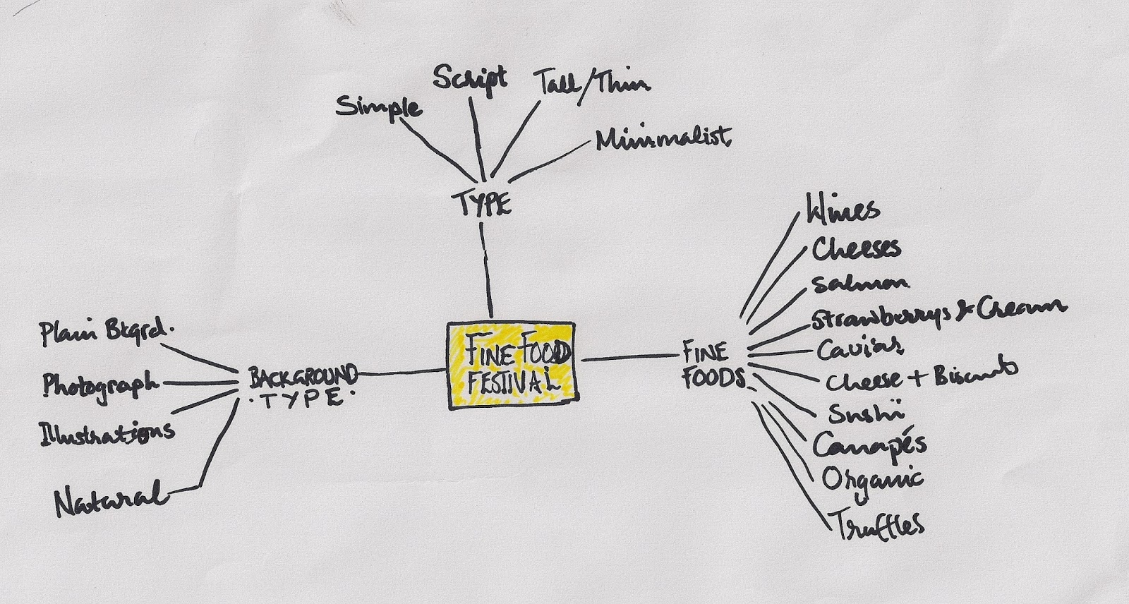
The Concept - Tantalise the viewer with the idea behind the poster, the message to go beyond the written word, classy, exciting, for the niche market and simplicity & minimalism is key.
I've used a stock photograph which shows not only an oyster but someone gleefully eating it.
The reason I ,chose the oyster for this poster is because the oyster is widely considered to be an aphrodisiac and this aspect of it says ' fun, excitement & more to look forward to'.Oysters are now an expensive delicacy for a niche market and I felt that this took care of the festival being about fine food.
Tuesday, 7 January 2014
Friday, 13 December 2013
Tuesday, 10 December 2013
Subscribe to:
Comments (Atom)


